04 / Case Study
Symmatrics
Naming and launching a quantum encryption company.
- Role
- Marketing Engagement Lead, Polaris Partner Group
- Period
- 2025
- Disciplines
- Naming · Brand Creation · Messaging Architecture · Go-to-Market · Web
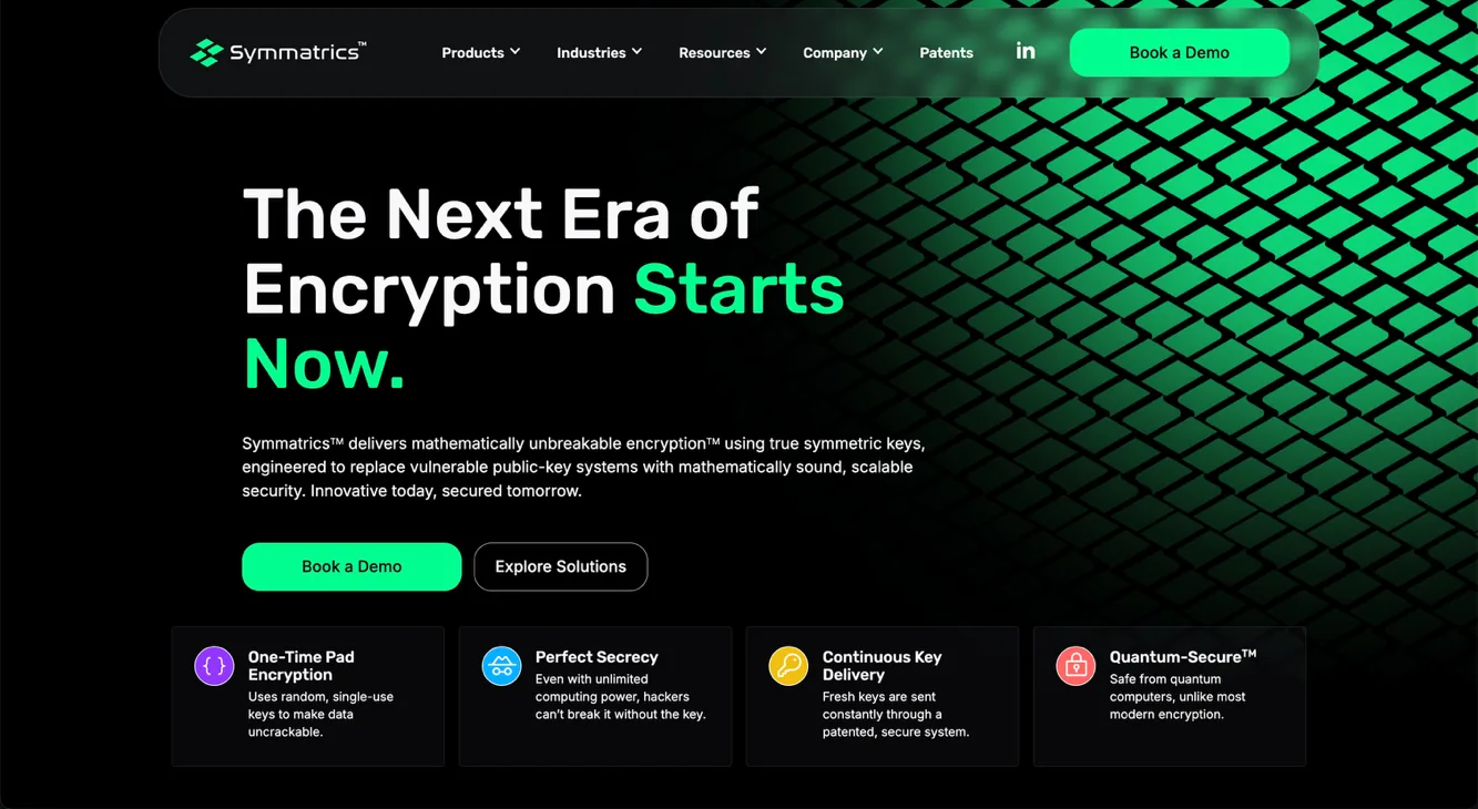
Context
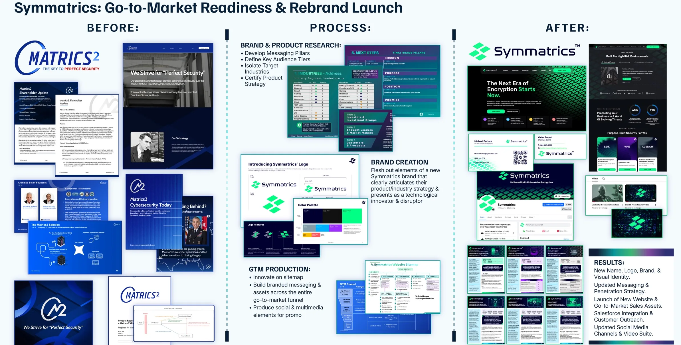
Matrics2 had genuinely differentiated technology — one-time-pad symmetric key encryption positioned for a world where public-key cryptography is no longer safe — and a brand that actively undercut it. The identity, the name and the materials read like a mid-2000s defence contractor rather than a company making a claim about the next era of encryption.
Discovery reached a blunt conclusion: as a brand, Matrics2 was a non-factor in market. There was no equity to protect and no homage required, which made this a genuine clean slate rather than a refresh.
The harder constraint was audience. The company needed to be legible to three groups who read the same page completely differently: investors and investment groups, thought leaders and market makers, and customers and prospects in banking, finance and government.
My role
I led the full rebrand as engagement lead — naming, visual identity, messaging architecture, and audience-tier strategy — and took it through go-to-market launch.
That included the brand and product research foundations, the new website from sitemap through live build, the go-to-market funnel with Salesforce integration and customer outreach infrastructure, a documentation refresh across internal and external materials, and the social and video suite for launch.
Selected work
Before and after
Positioning and audience tiers
Brand and product research came first: where the company could credibly compete, and which audience had to be convinced in what order.
Three names, then a fourth
Because there was no existing brand equity to preserve, naming started from a genuinely open brief. Three distinct concept directions were curated to explore and refine.
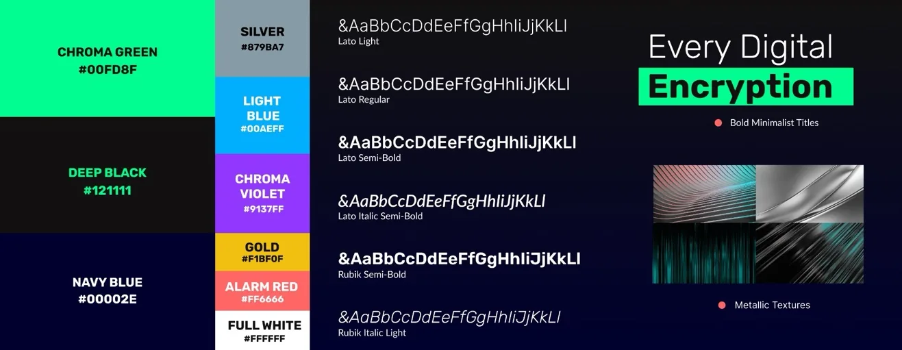
Brand pillars
The Symmatrics identity
The name that won kept the Matrics root after all. The logo mark is built from offset symmetrical diamonds — a direct reference to symmetric keys — and resolves into a modern technical brand rather than a defence one.
Sitemap to UX to live
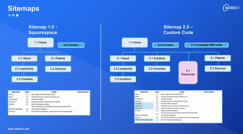
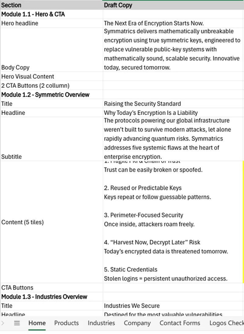
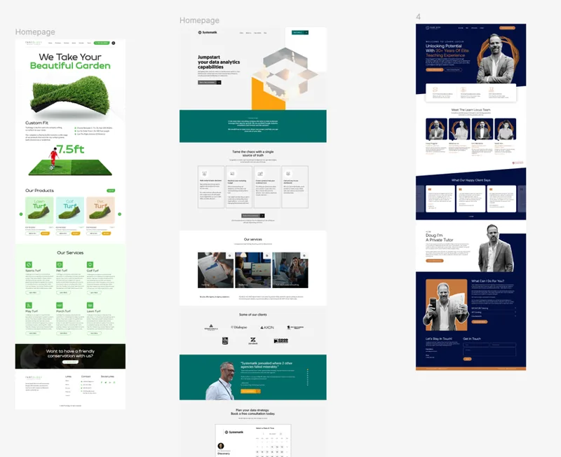
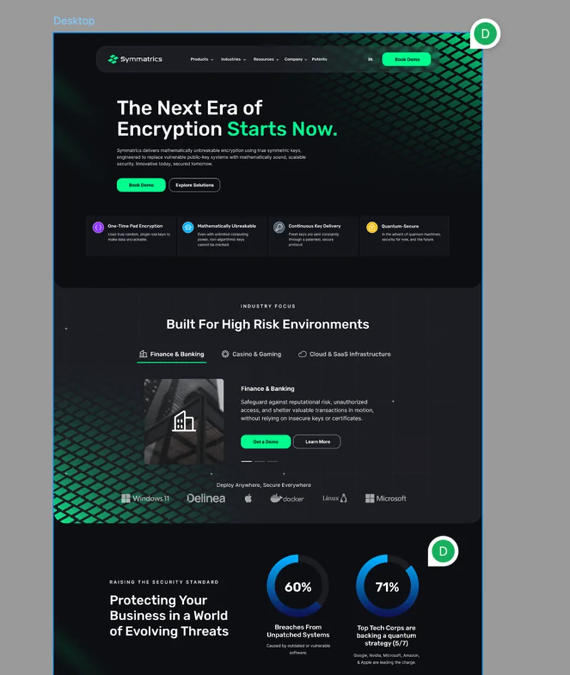
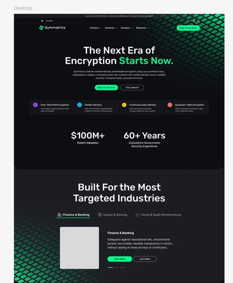
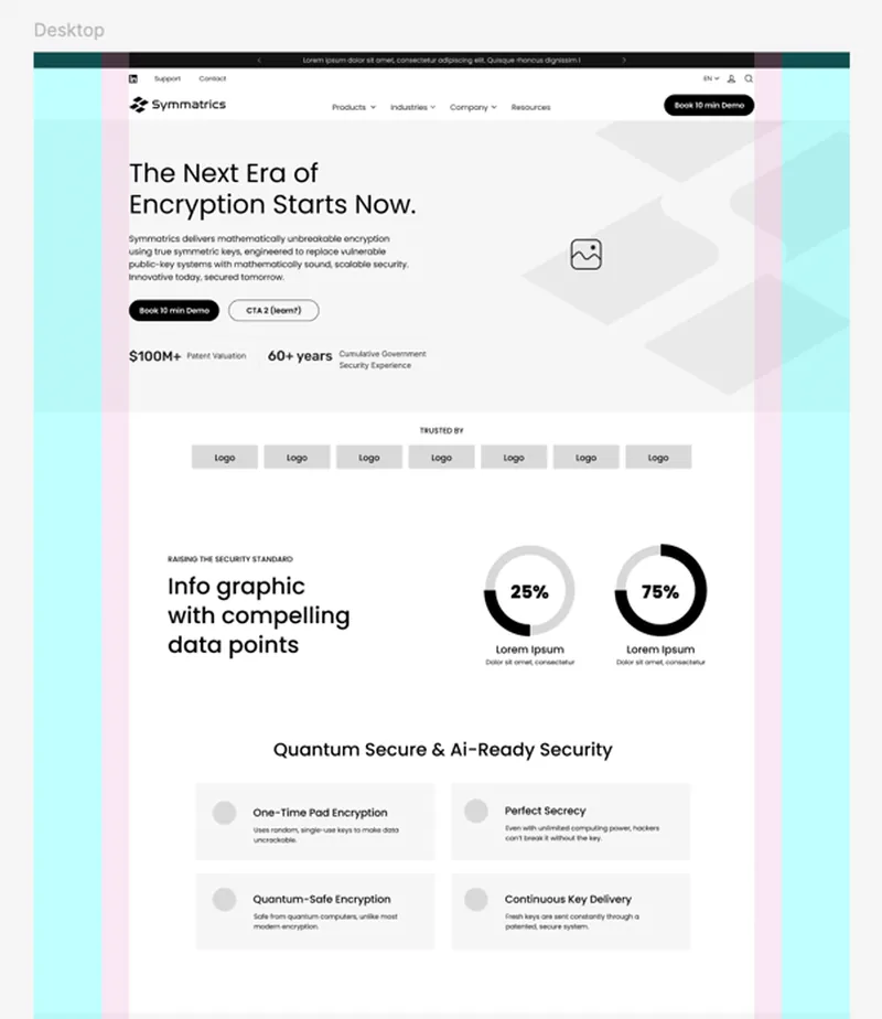
The old site was a Squarespace build. The new one was planned as a sitemap first, then written module by module, then designed and built as custom code.
What changed
- New name, logo, visual identity and messaging architecture, delivered through to go-to-market launch.
- Brand and product research foundations established: messaging pillars, competitive positioning, and audience segmentation across three market tiers — investors and investment groups, thought leaders and market makers, and customers and prospects.
- New website launched from a rebuilt sitemap — 16 pages and 32 unique content modules — replacing the previous Squarespace site with a custom build.
- Complete go-to-market funnel launched, including Salesforce integration and customer outreach infrastructure.
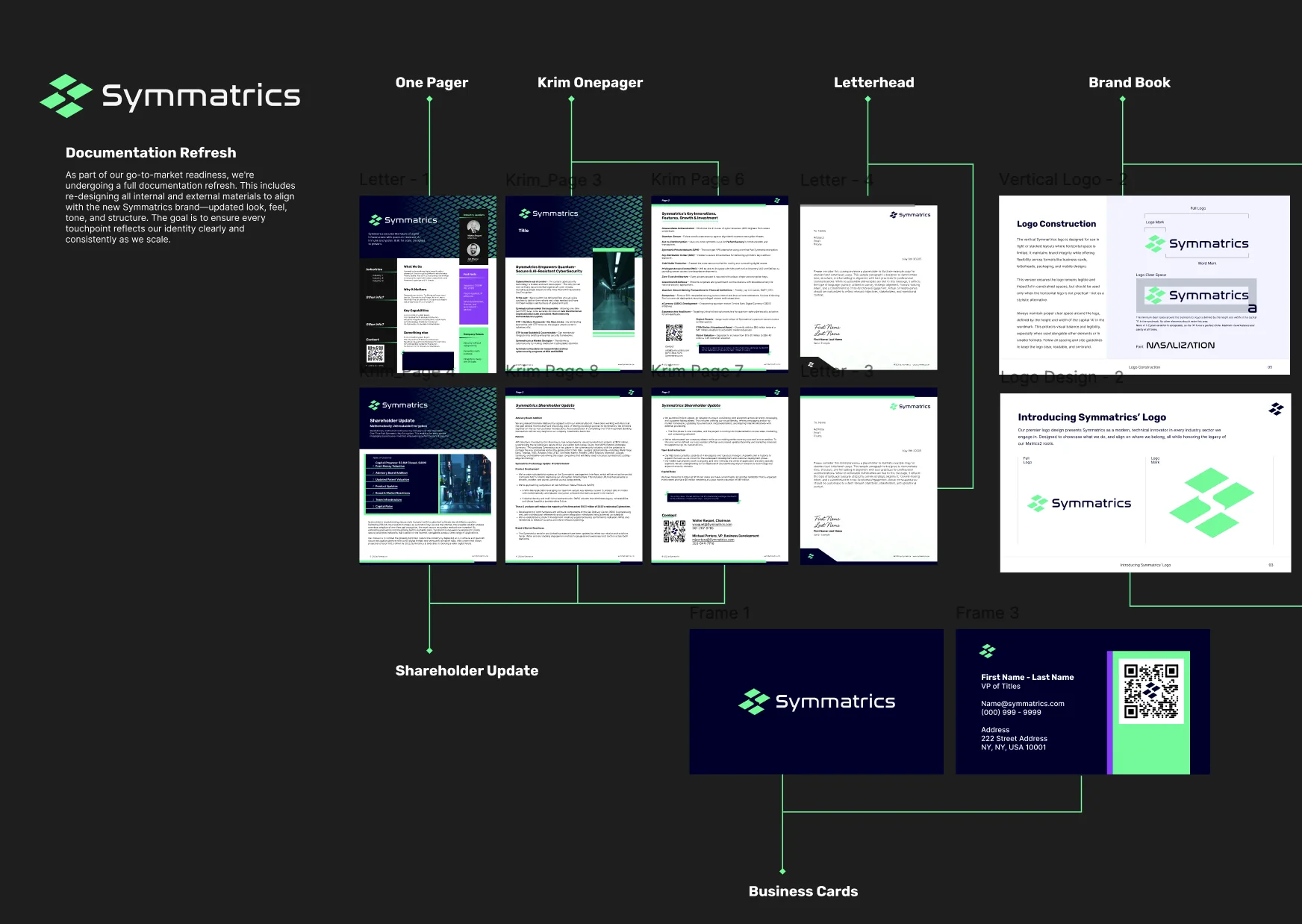
- Internal and external documentation refreshed across one-pagers, shareholder updates, letterhead, business cards and brand book.
- Social channels and a launch video suite updated to the new identity.
Looking back
Discovery produced the most useful finding early: as a brand, Matrics2 was a non-factor. That removed the constraint most rebrands spend their energy negotiating — no equity to protect, no homage owed — so we explored three clean-break directions, Flux, Nexus and Quantara. The name we landed on kept the original root anyway, which was not the outcome the brief pointed at.
What I would change is sequencing. The audience-tier work ran alongside the identity rather than ahead of it, and several visual decisions had to be revisited once we were honest about how differently an investor and a pilot customer read the same page. Tiering first would have saved a round.